BlackHat and WhiteHat
Blackhat - Link - https://vizhub.com/LG0498/ba75f85f41a4461b961b2e1d62adf745?edit=files
The color choices of the background could be improved. The orange background is not necessary and a white would be easier to read.
The title is quite vague. This may be due to the fact that it is out of context but at first I did not know what was being talked about (I don’t really know).
The x axis starts at 1999 but the data starts at 2000. This doesn't really make sense since they could just start it at 2000.
The y axis also starts at 200 instead of starting at 0 which also leads to a misleading visualization.
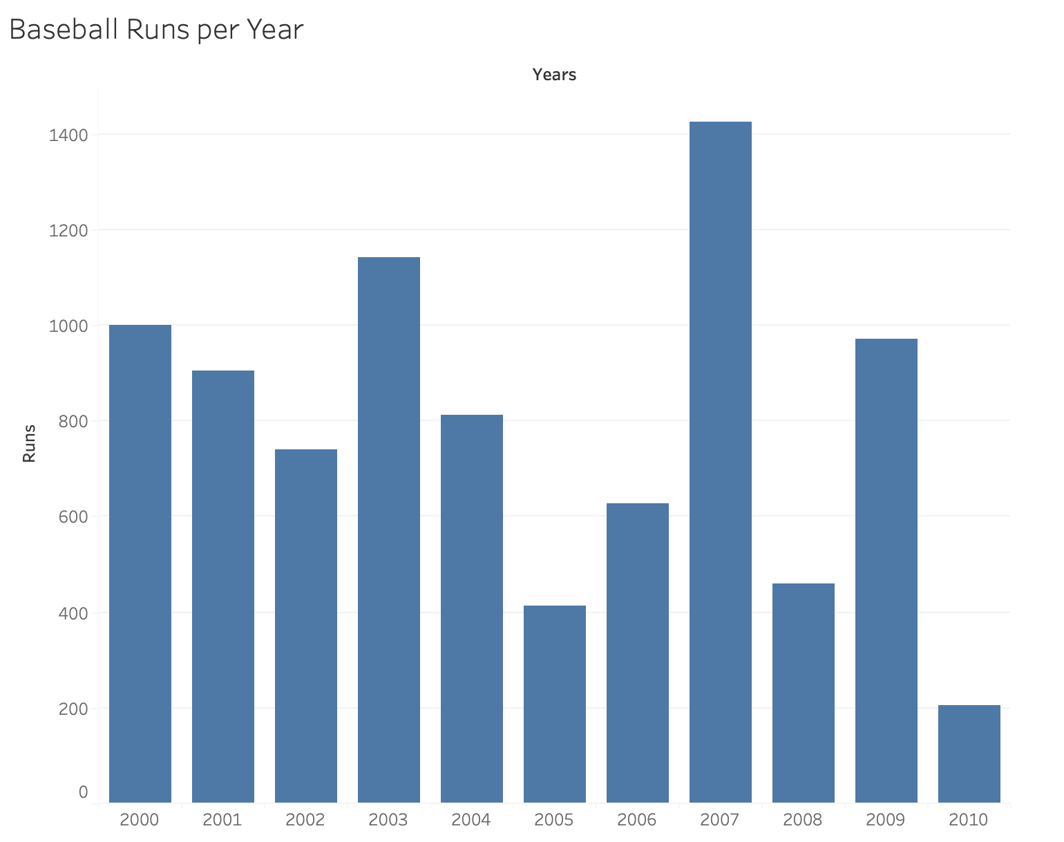
Whitehat

This is an improvement since now it is a barchart and for each year it is very clear how many runs there were.
Now the y axis starts at 0
The colors are not confusing now.